Charts represent the price data fluctuations caused by varying market forces. The information found in these charts enables a chartist skilled in the science of technical analysis to draw trading signals for future price activity. The primary chart types used for the analysis are:
- Line Chart
- Bar Chart
- Candlestick Chart
The most popular type of chart in use today is the candlestick chart. Originally developed in Japan, it did not come into popular use until the 1980s. The line chart is the original type of chart and is still in wide use today, primarily due to its convenience and effectiveness in plotting price data over extremely long and short periods of time. The bar chart is also used by many traders. Although any one of these chart types can be used equally well for most analytical techniques, most traders develop certain preferences for use in their analysis.
Line Chart
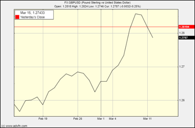
In order to plot a line chart, single prices for a selected time period are connected by a line. The most popular variation of the line chart is the daily line chart, which plots each day’s closing price. The basic problem with the daily line chart is its lack of data on intraday market activity.
Here is an example of a line chart for GBPUSD (the pound against the dollar):
Bar Chart
A bar chart shows the opening and closing prices, as well as the highs and lows, so allows the trader to see the price range of each period.
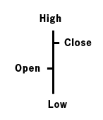
Any given line in the bar chart consists of four important points.
- High – The top point of the vertical bar
- Low – The bottom point of the vertical bar
- Opening Price – A small horizontal line to the left of the vertical bar
- Closing Price – A small horizontal line to the right of the vertical bar
As the price fluctuations become increasingly volatile, the bars become larger, and vice versa.
Here is the same chart for GBPUSD, this time as a bar chart:
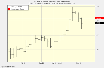
The bar chart’s advantages are its ability to display the price range over the selected period as well as its capacity to plot price gaps. One of the bar charts major disadvantages however is its inability to plot the whole price fluctuation, even when plotted for extremely small periods of time.
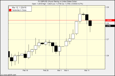
Candlestick Chart
The candlestick chart is quite similar to the bar chart as it also consists of the same four primary price points: the high, the low, the open and the close. The candlestick is often considered easier to view and thus analyse than its bar and line chart contemporaries.
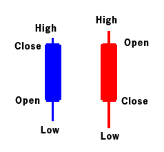
The high-to-low range is still indicated by a vertical line, but the larger block in the middle shows the range between the opening and closing prices. The charts also use different colours to help visualise bullish or bearish sentiment.
Traditionally, if the block in the middle is filled or coloured in, then the currency pair closed LOWER than it opened.
Here’s that same GBPUSD chart, this time showing candlesticks:
The information provided in this article is for informational purposes only and should not be construed as financial, investment, or professional advice. The views expressed are those of the author and do not necessarily reflect the opinions or recommendations of any organizations or individuals mentioned. Always consult with a qualified financial advisor or other professionals before making any financial decisions. The author and publisher are not responsible for any actions taken based on the content provided.